The Elephant & The Rider: The psychology of conversion rate optimisation
Our rational self has grand plans to lose weight or to be productive, however when a waiter asks us if we want to see the dessert menu or when our alarm goes off at 6am, we sometimes cave. Why is that?
I recently learnt an interesting metaphor from ‘The Happiness Hypothesis’ by Jonothan Hiadt. This concept was called ‘The Elephant and the Rider’. The rider is our rational brain whereas the elephant refers to our emotional, subconscious brain. Most designs fail because they are too heavily focussed on the rider. But in reality the rider has less control than they think and often takes a back seat in a lot of our decisions.
“Our conscious mind is like “a supporting character who believes themselves to be the lead actor and often has little idea of what’s going on.”
Here's a quick test for you. The task is to simply read the text (not the colour) and time yourself for each one.
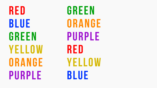
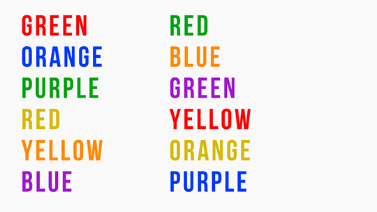
Did that second one take you a bit longer? Could you feel the strain of trying not to say the colour? Conscious thinking is a finite resource and when we force users to switch to their conscious system to try and comprehend a product, they will soon question if this is worth their precious brainpower.
I'm certainly not saying that perfectly designed pages and flows mean a user will cruise through the conversion process without conscious thought. But we need to ensure that we are not forcing users to deplete their brainpower unnecessarily.
Here are some key areas which you can focus on to keep your users in the subconscious thought system.
Priming:
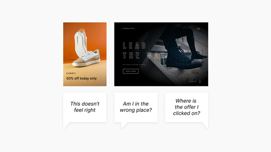
Your landing page may have awesome copy and all the design bells and whistles but if it doesn't share a common theme with the ad which links to it then you will cause the user to trigger the long thinking system.
It sounds simple but ensure that you know where traffic is coming from, what imagery, copy and call to action is being used. Ads and landing pages have to share similar styles, copy and themes to avoid this friction point. Below is an example of ineffective priming. The user is taken to a page with a different copy and style which causes confusion.
Imagery:
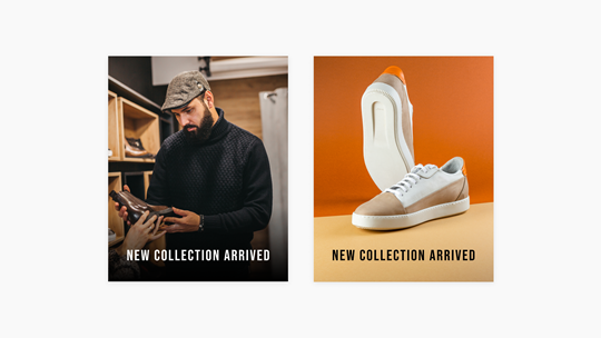
It takes 50ms for users to form a decision about a design and as you can’t even read a word in that time it highlights how important image selection is. Ask yourself these 3 questions when selecting imagery. Is it consistent with the ad that the user is coming from? Does it clearly and simply show what this page is selling? Does it align with the emotions I'm trying to elicit?
Here you can see 2 versions of imagery. The first focuses on the wrong subject which means we are forcing the user to consciously process the message. The second is clear with a single point of focus allowing the subconscious to deal with the processing.
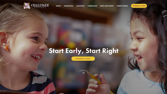
What age range do you think this school teaches? They actually teach up to 16 however the imagery automatically makes users assume this is early years education which could easily lose users who are actually in the target market before they’ve even read about the offering.
Anchoring:
A group of participants at the San Francisco Exploratorium were asked 2 questions:
Is the height of the tallest redwood tree more or less than 1,200 feet?
What is your best guess about the height of the tallest redwood tree?
The median answer from the group was 844 feet. When the question was asked to the second group, 1200 feet was changed to 180 feet. The average guess then came out at 282 feet - that's a 66% difference! The anchoring effect happens when we use an initial piece of information to make subsequent judgments. Participants are automatically influenced by initial information which affects the perceived value of subsequent decisions.
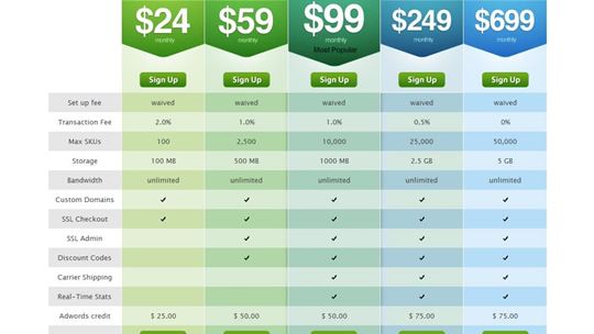
You can see this kind of technique used frequently on pricing pages. Putting other options which are on the extreme ends of their offering tend to nudge users toward the middle plan. Notice below we have a basic plan which removes a lot of features and a premier plan which has a big price increase. Although they likely don’t have a high percentage of their customers on these 2 plans, the extremes of each anchor the user toward the business plan and make this feel much more appealing.
So how do we test our designs?
I’m a huge advocate of testing early and often, however the formal setting of a standard usability test can easily make participants move into their conscious thinking systems. A great way to test subconscious thinking patterns is to run 5 second tests. This is where you show the participants a part of a design for (you guessed it!) only 5 seconds and then when the design is no longer in view ask them to recall certain aspects of it. The user doesn’t get time to dig deep into the content of the design so you are getting the instinctive reaction to your designs. This doesn’t just stop at web or app pages, the same 5 second tests can be used to evaluate how a brand is perceived. For example, a study can be run which shows the participants a logo for 5 seconds and then afterwards the researcher asks the participant to describe the logo/brand name in 3 words. The team can then compare the participants reaction with emotions they were trying to elicit to validate the brand concept.
When reviewing quantitative data such as Google Analytics a good place to start is checking the bounce rates. This usually shows a disconnect between what the user was expecting to see vs what they were presented with. Search for pages and flows which have high bounce rates then clarify where the user is coming from (social ad, PPC, email comms, etc). Ensuring there is consistency in messaging and style across this journey should reduce bounce rates dramatically.
Have you ever felt an online experience which was so smooth that you’ve hit the “thank you for placing your order screen” without much of a second thought? I liken it to when you are cutting wrapping paper and your scissors hit that smooth glide. More often than not this is because the team behind the design and user experience have carefully considered how a user's subconscious plays into their decisions making. Be sure to cover the above aspects and you too will be well on your way to taming the unruly subconscious elephant!
Where would you like to go?
We’d love to understand more about your business needs and challenges. Talk to a team of exciting minds and create a collaborative partnership focused on driving growth for your business.